Women’s College Hospital
Designing and building an onboarding platform and file repository for nurses at Women's College Hospital
The Project at a Glance
-

Objective
Creating an internal file repository website for onboarding nurses at Women's College Hospital
-

Research Methods
User interviews and card sorting sessions to understand mental models, with tree testing to validate hierarchy
-

Design Process
Wireframing, client feedback sessions, and complete build of SharePoint site
-

Outcome
Tree testing demonstrated that our new information architecture resulted in completion rates of 87.5%
User Studies & Competitor Analysis
After being assigned to our clients at Women's College Hospital, my team of UX Designers learned about their desires to create a comprehensive platform to assist in the information retrieval needs of onboarding nurses at the hospital. In order to facilitate this, my team conducted user research to understand the needs of new nurses and mental models for information organization.
1 | Card Sorting
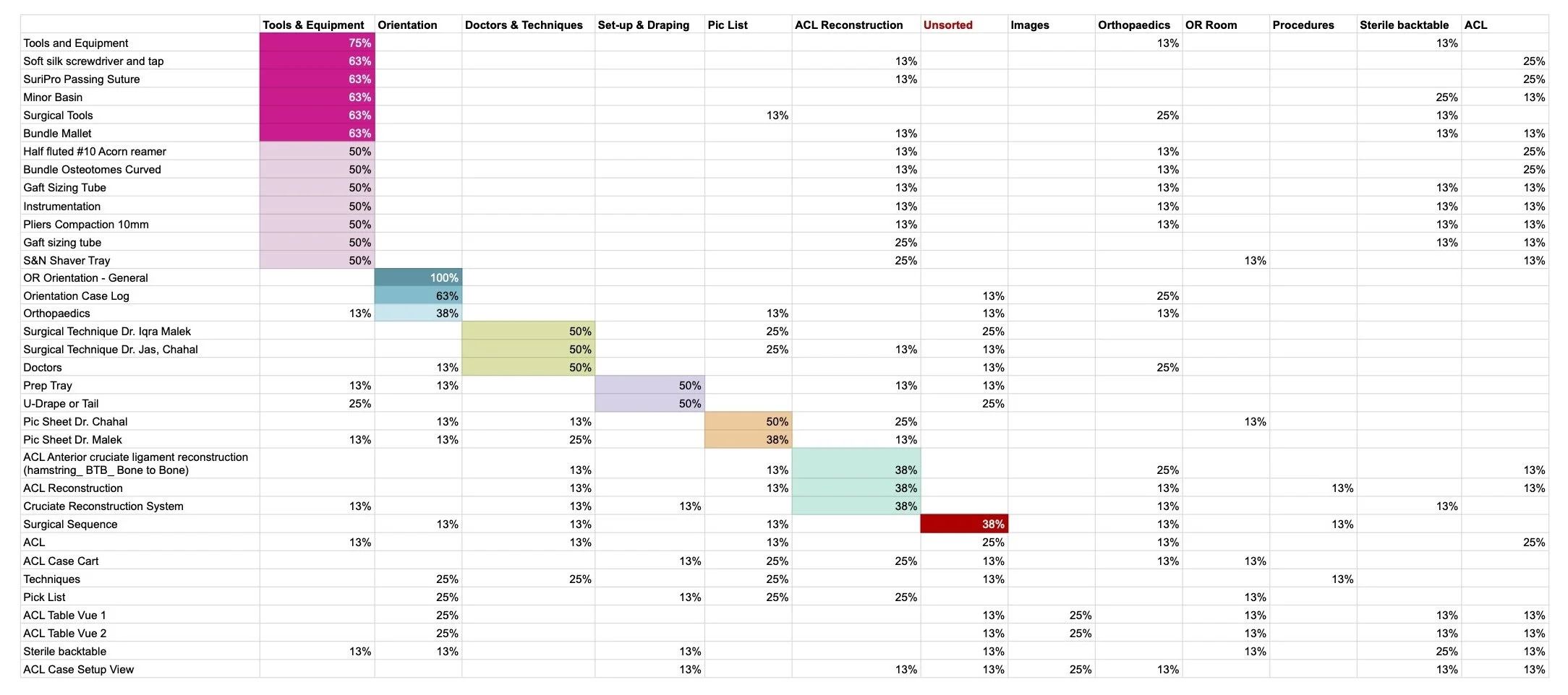
As the first step in our user study, we conducted 15 minute card sorting sessions with 8 nurses at the hospital, recruited by our clients, in order to understand mental model of users and expectations of labeling conventions. Each nurse sorted 35 content cards created from existing SharePoint documents and labels. Following the study, I completed a quantitative analysis of the data to allow us to view trends in the study results, as is shown below.
2 | User Interviews
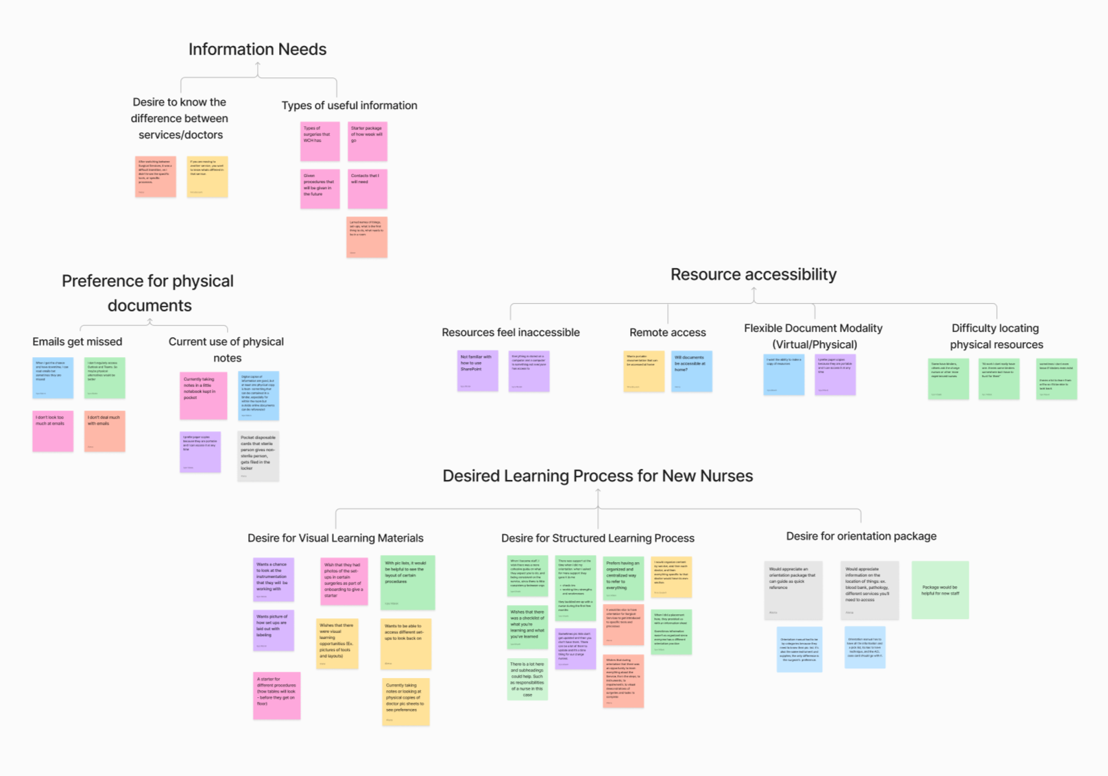
Following the card sorting sessions, my team facilitated one-on-one interviews with our representative users, in order to better understand their information needs, desires, and current experiences finding information. Following the interviews, we synthesized the data into an affinity diagram to analyze the common themes, allowing us to synthesize three primary needs.
-

Lack of Standardized Documentation
Nurses struggled with finding resources related to surgical services due to a lack of centralized access to critical information
-

Steep SharePoint Learning Curve
Several nurses expressed having difficulties using SharePoint, with desires for an easy-to-use platform
-

Need for more Visual Learning Guides
Nurses felt supported when they had visual aids and clearly structured documentation when onboarding
As the final step in our exploratory research process, my team conducted a competitor analysis looking at possible alternatives to SharePoint. By examining factors such as cost, security, features, and ease of use, we were able to provide an overview of other platform options for our clients to reference.
Due to client budget constraints, we chose to move forward using SharePoint, as Women’s College Hospital had existing access to the platform.
3 | Competitor Analysis

Information Architecture
After conducting our user research, our team began creating a comprehensive and consistent Information Architecture to minimize the mental load on nurses while seeking information.
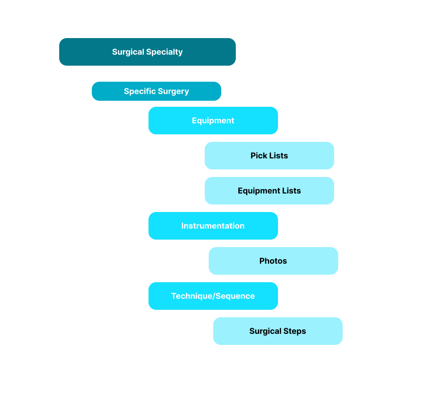
Using the results of our card sorting study and additional input from our client contacts within the hospital, our team developed a simple information architecture structure that would provide a consistent experience between surgical specialties and each specific surgery. We developed an information architecture diagram in order to organize this information for use in our final build.
1 | Information Architecture Diagram

In order to validate our information architecture, our team conducted tree testing with four nurses at the hospital each completing four tasks, where they were instructed to find different content. Our test resulted in an average success rate of 87.5%, a score that can qualified as "Very Good" according to the Nielsen Norman Group, validating the efficacy of our newly created information hierarchy.
2 | Tree Testing
High Fidelity Designs and User Flows
Using feedback that we received from our clients on initial low fidelity designs, our team designed high fidelity wireframes for the types of pages that we would be creating. We displayed the paths that users would take in order to access different types of information through three primary user flows: the Onboarding flow (purple), the Surgical Specialty flow (red), and the Discussions flow (turquoise).
Following this, we completed usability testing with our client partners, showing them each of the screens and asking a series of questions to find where their eyes were drawn to and what they thought were the most important elements on each of the pages. Using the results of these feedback sessions, we made notes for the changes that would need to be implemented in the actual site build on SharePoint.

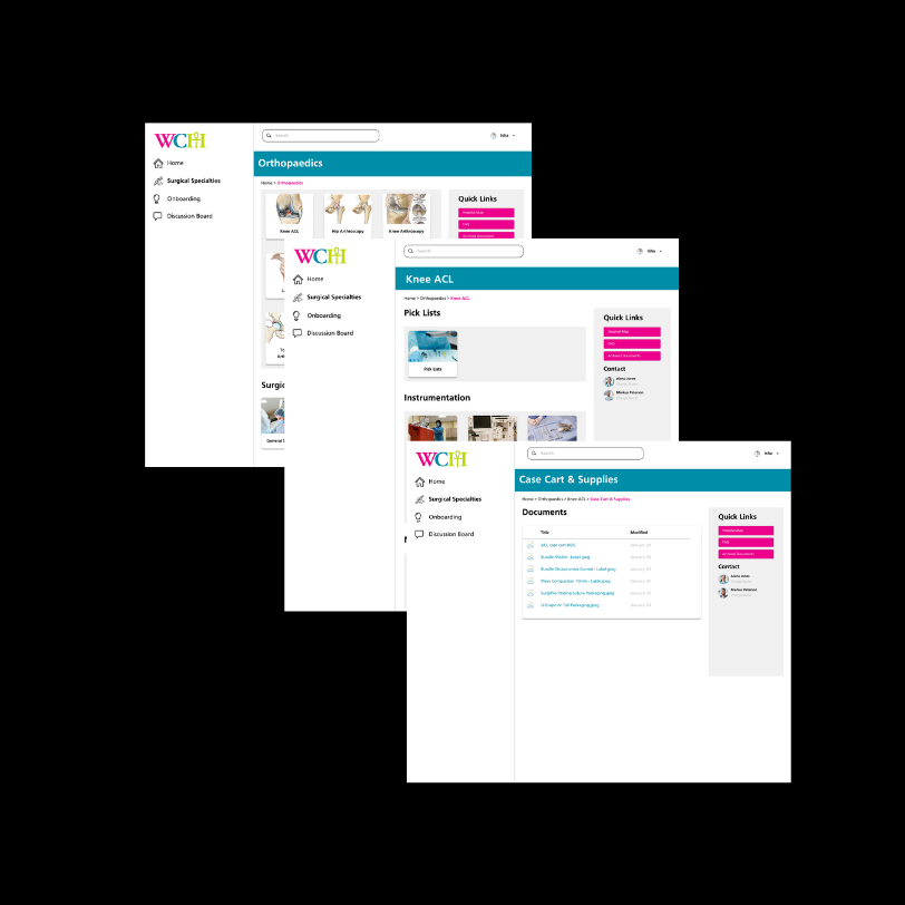
Final Build and Client Handoff
After receiving client approval for our designs, our team began the process of building the final SharePoint website that would be used by our clients. I took the lead on this part of the project, leading the build process and collaborating with other team members on the creation of documentation for the future maintenance of the site.
As the final step in our project, we presented our work to our client stakeholders at the hospital and completed the project handoff.