Nature Navi
Designing a one-stop Toronto park-finding mobile app allowing users to effortlessly locate local parks
The Project at a Glance
-

Objective
Discovering ways to improve the parks and greenspace finding experience for Toronto residents
-

Research Methods
Secondary research and user study with one-on-one interviews and surveys to uncover user pain points
-

Design Process
Design ideation, wireframing, creating user flows, and conducting guerilla style usability testing
-

Outcome
User feedback showed NatureNavi significantly improved and eased user parkfinding experiences
Exploratory Research
To understand the market space that we were designing for, my team of UX Designers conducted exploratory research to better understand user needs and opportunities for design solutions within the parks navigation problem-space.
1 | Secondary Research
Publicly available municipal government reports, blog posts, and news articles revealed that Toronto residents struggle with easily finding parks that are accessible via transit, are adequately maintained, and have their desired park amenities.
2 | User Studies
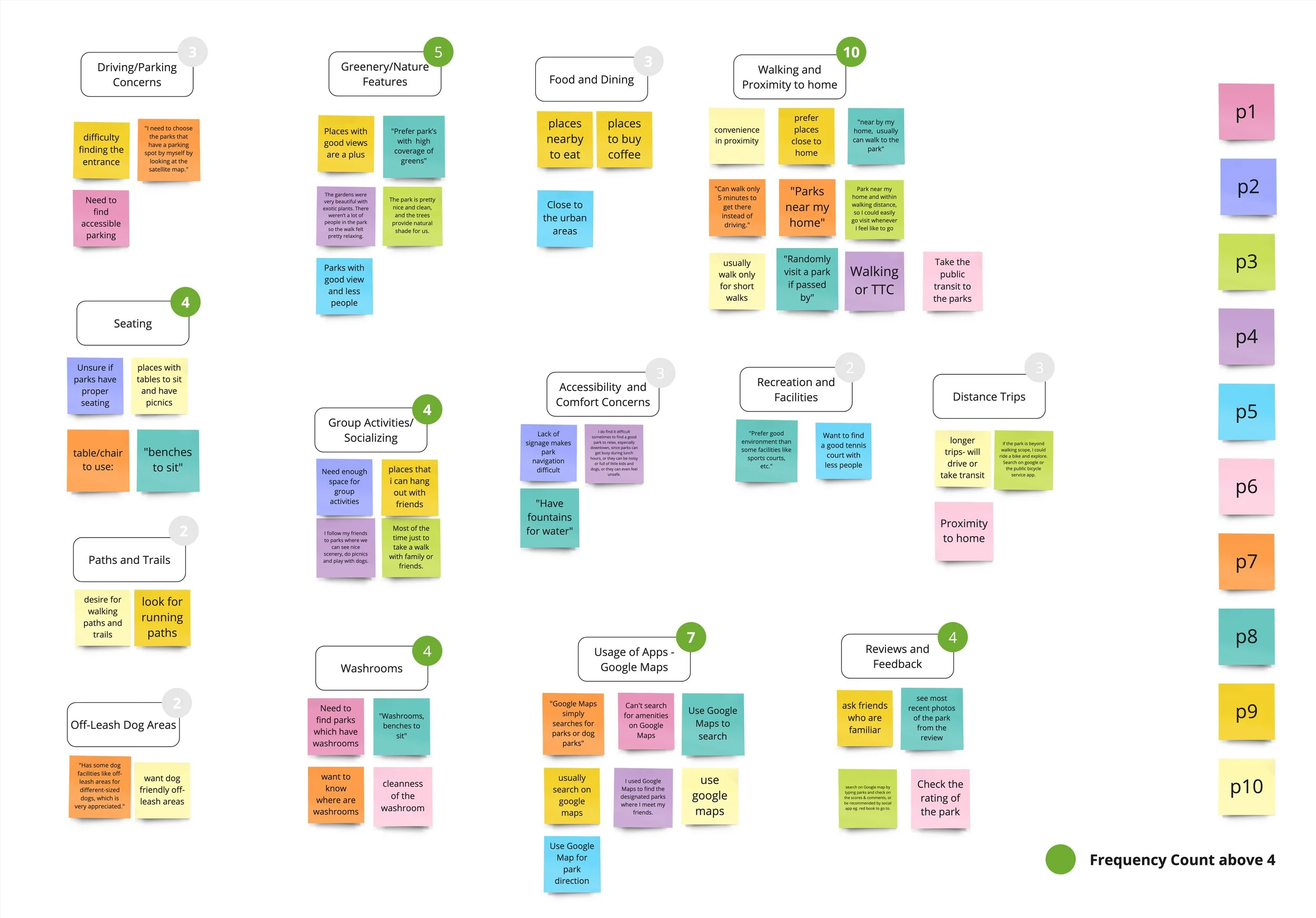
My team conducted an online survey with 42 respondents and held semi-structured one-on-one interviews with 10 representative users in order to better understand the key factors and pain points in their parkfinding experiences. After visualizing the user data in an affinity diagram, we synthesized the following primary considerations for Toronto parkgoers:
-
Proximity to Home
36 survey respondents and 10 interviewees stated that proximity to home was a key factor in their park selection process
-

Knowledge of Amenities
More than half of the participants responded that knowledge of amenity availability was essential, with desire to know about washrooms and seating areas
-
Access to Reviews
Survey takers revealed that they valued park reviews from others, with word-of-mouth and online reviews noted as two primary methods
Design Ideation
To understand the market space that we were designing for, my team of UX Designers conducted exploratory research to understand user needs and opportunities for design solutions. After creating affinity diagrams and empathy maps to analyze our research findings, we developed a user persona, envisioned the user journey, and ideated on ways to improve the situation.
1 | User Persona: Paul Parkson
In order to bring the research findings to life, our team developed our user persona, Paul Parkson. Paul is a Toronto-residing graduate student interested in exploring new parks in the city. His primary obstacles include limited amenity information availability, finding outdated information, and needing to rely on word-of-mouth reviews.

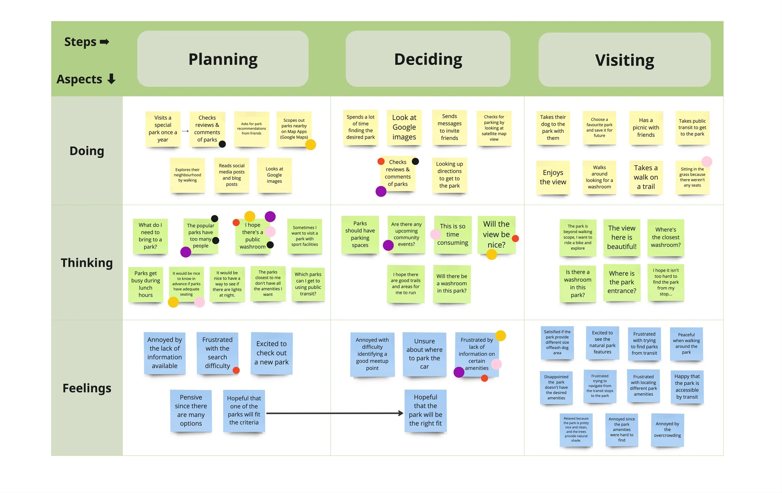
2 | As-Is Scenario
After creating the user persona, my team created an As-Is Scenario to depict the key moments that were causing issues in Paul's parkfinding journey. Linking user issues discovered in the research stages to distinct and specific moments in the parkfinding experience allowed for my team to understand Paul's primary needs in this domain.
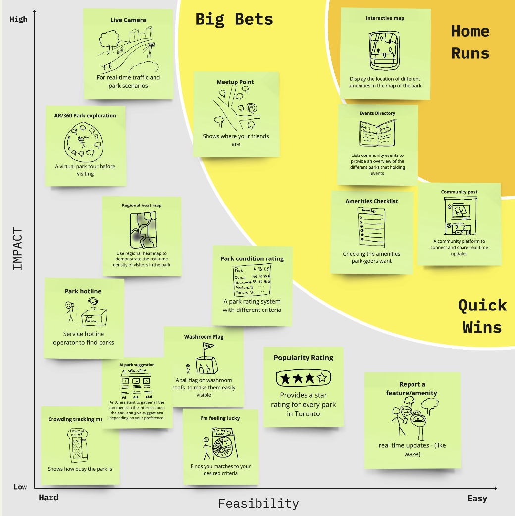
After unveiling Paul's primary needs, my team began to ideate on solutions that could solve the problems, mapping them onto a prioritization grid with the axes of impact and feasibility. This allowed us to see which solutions would be low-effort to implement, while additionally having high impact on solving user issues.
3 | Prioritization Grid of Design Solutions
4 | Ideal Situation Visualization
Using the most impactful and feasible design ideas, my team then laid out the ideal scenario for Paul in his parkfinding journey, demonstrating specific instances where our chosen design solutions would significantly improve his situation.

Low Fidelity Designs
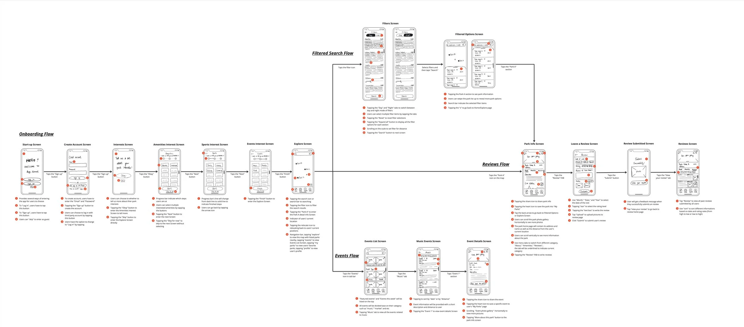
To start bringing our design solutions to life, our team created a low-fidelity storyboard consisting of the four primary flows in which our solutions would occur: the onboarding flow, the filtered search flow, the events flow, and the reviews flow.
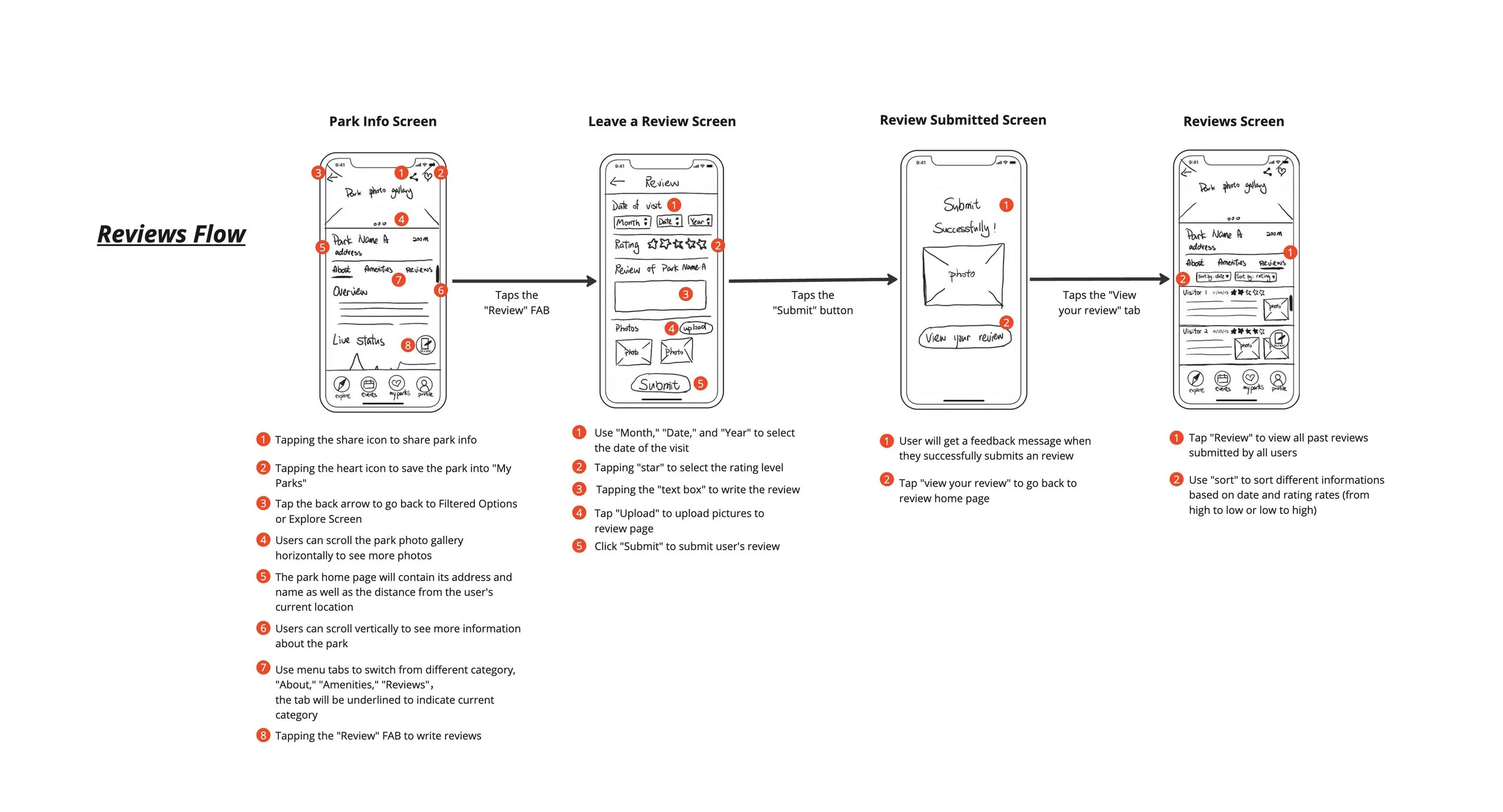
Within each flow, our team identified key elements that users would need to interact with within each screen in order to accomplish their primary goal, as can be observed in the reviews flow shown below.
Design Refinement
Following the creation of the low-fidelity storyboard, we conducted 3 sessions of guerrilla usability testing in order to refine our designs. By having representative users try out the features, we uncovered three key findings that allowed us to improve the app design in our mid-fi prototype.
Users expressed that that they were sometimes confused with the labeling conventions that we had used. An example of this can be seen in the onboarding task where there was an option for users to “skip” signing in when accessing the app without an account. Due to this feedback, we changed this label to “Enter as a Guest.”
Clarify language used for labels

A second place where this problem was noticed was in the tab bar. Originally, our third tab was labelled “My Parks,” meant to include parks that the user had saved. However in testing, participants questioned whether a user’s saved events would be located there as well, which made us realize that we needed to expand the label to “Favourites” in order to better encompass the range of content that could be stored under this section.

Enhance visibility of key features
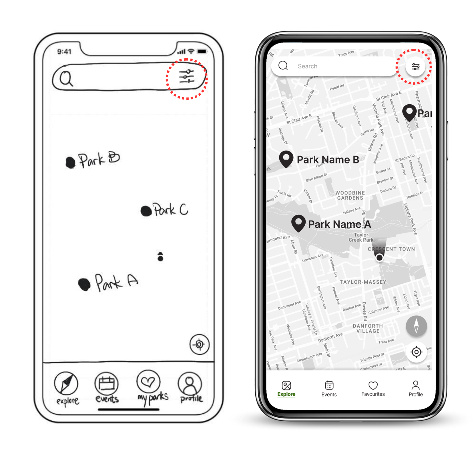
The second issue expressed by users was having issues with locating feature buttons, leading to them clicking on the wrong components while completing tasks. When users were asked to complete a filtered search, often would click on the search bar rather than the filter icon. In order to resolve this issue, we created a more distinct filter button to draw user attention to the app features.
The final feedback point that our team received was in regard to the text-image ratio on listings pages. This can be observed with the music events listings screens on the right. The low fidelity screens initially had a text-based events listing system. However, due to user feedback, we chose to add images to the events listings, in order to provide parkgoers with a clearer idea of what sort of events would be happening.
Improve the image-to-text ratio

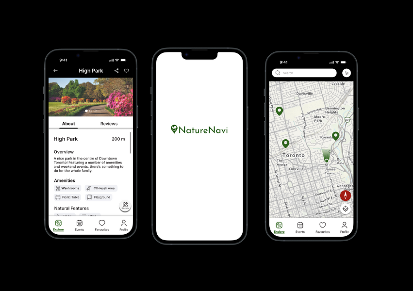
Final High Fidelity Prototype
Following the end of the project, I designed a high-fidelity clickable prototype of NatureNavi based on the feedback from my team's low-fidelity and medium-fidelity designs, shown in the video on the right.
Addressing key user pain points of amenity/feature searching, easy-to-find park reviews, and event displays, NatureNavi provides users with the freedom to explore Toronto parks and greenspaces in the ways that matter most.