Textile Museum of Canada
Redesigning the desktop and mobile sites for the Textile Museum of Toronto, allowing museum visitors to easily navigate site content
The Project at a Glance
-

Objective
Redesigning the navigation and content organization systems for the museum's online presence
-

Research Methods
Content auditing and card sorting to uncover mental models of users in terms of content organization
-

Design Process
Information Architecture diagramming, developing task flows, creating wireframes, and prototyping
-

Outcome
Stakeholders conveyed that our designs were innovative and met their needs
Content Auditing and Card Sorting
As the first step in our research process, my team of UX Designers ran a manual formal content audit of the existing Textile Museum website to determine which pages to keep, archive, and to identify potential gaps in scope. We used the criteria of Audience, Business Strategy Alignment, and Recency to evaluate site content.
1 | Content Audit
2 | Card Sorting
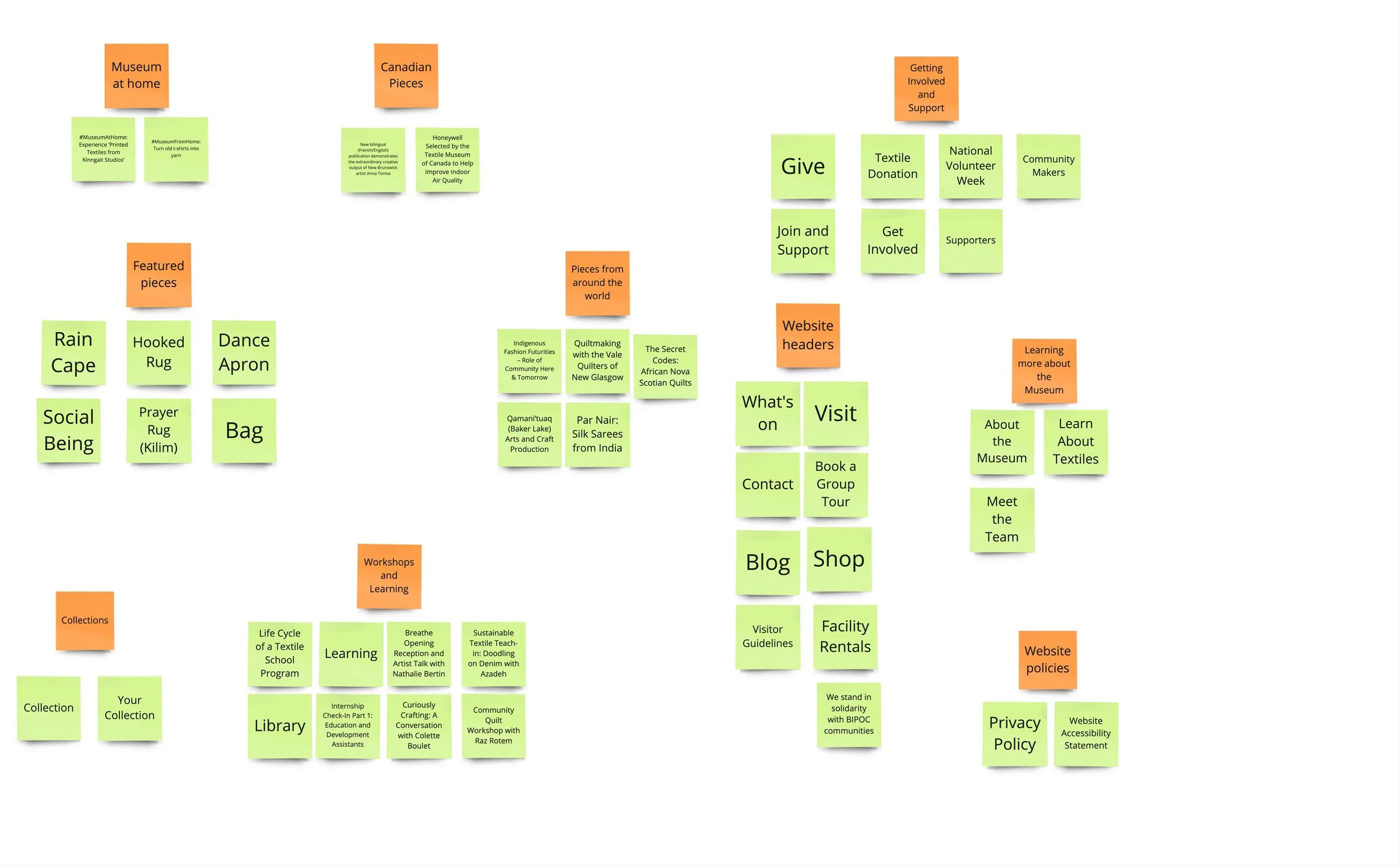
Following the content audit, my team conducted a series of card sorting exercises with potential site users. We chose 45 representative cards, representing different types of content which would be hosted on the final site for the card sorting exercise, which we ran with 8 participants. An example of the card sorting is shown here.
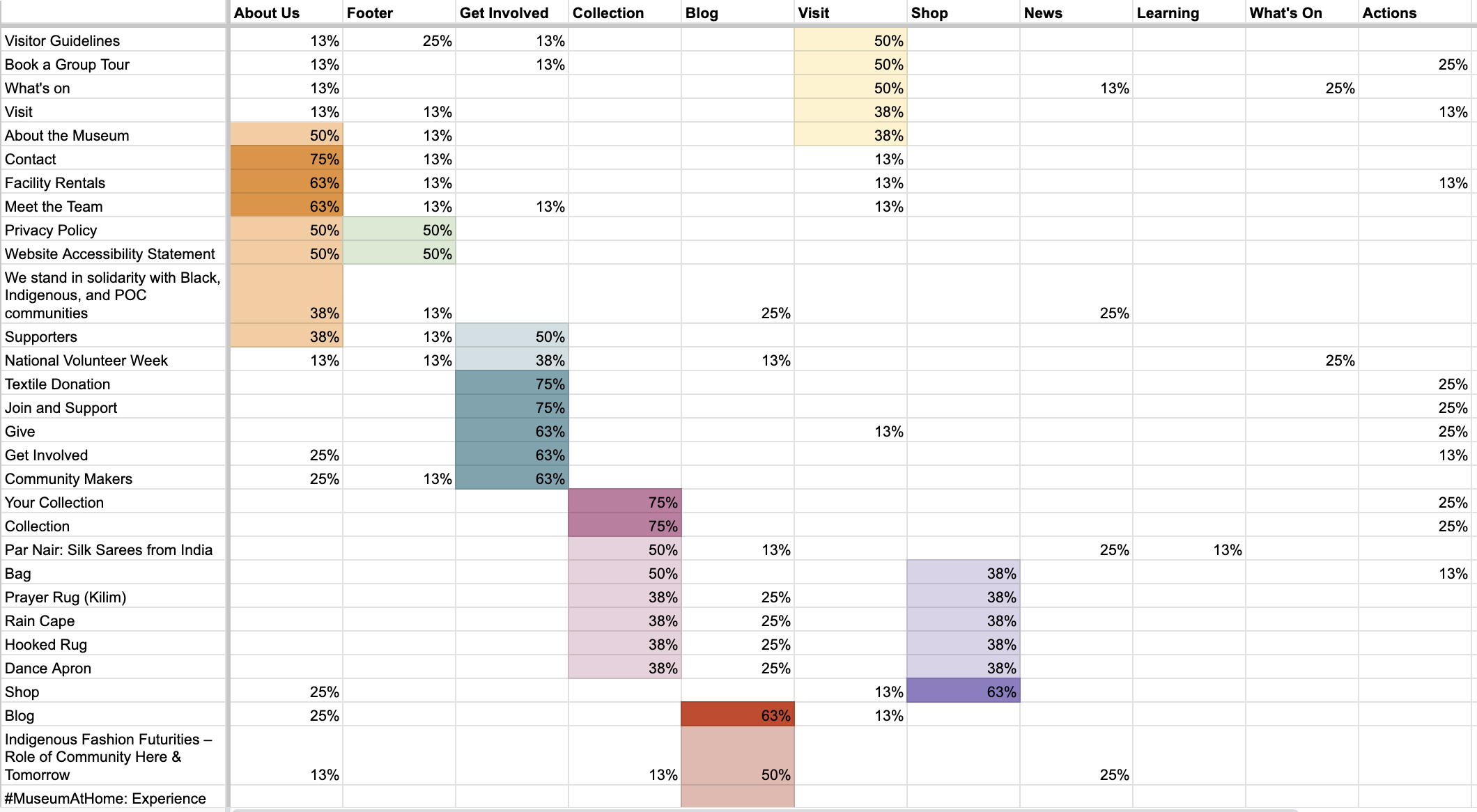
In order to analyze the combined results of the card sorts, I ran a quantitative analysis of our card sorting data in order to draw insights regarding the similarity of the card sorting results between the participants (as pictured below). This allowed our team to view trends in how museum visitors may expect the museum's content to be organized.
3 | Quantitative Analysis of Data
Information Architecture and Task Flows
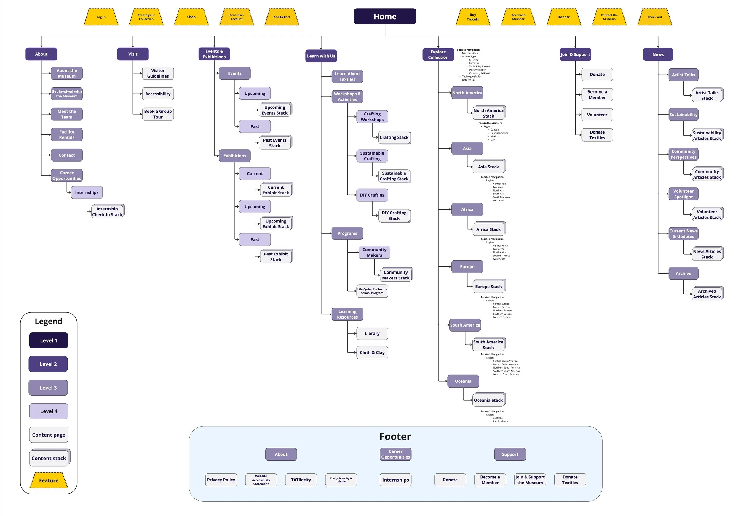
Using the insights derived from the card sort data analysis, I spearheaded the development of an Information Architecture diagram containing site content and features.
One area of particular interest was the Explore Collection page. In increasing the searchability of collections pieces, we chose to implement a filtered and faceted navigation system, which was based around the geographical origins of the collections pieces. This aligned with the museum's business objectives of centering communities within their art practices.
1 | Information Architecture Diagram
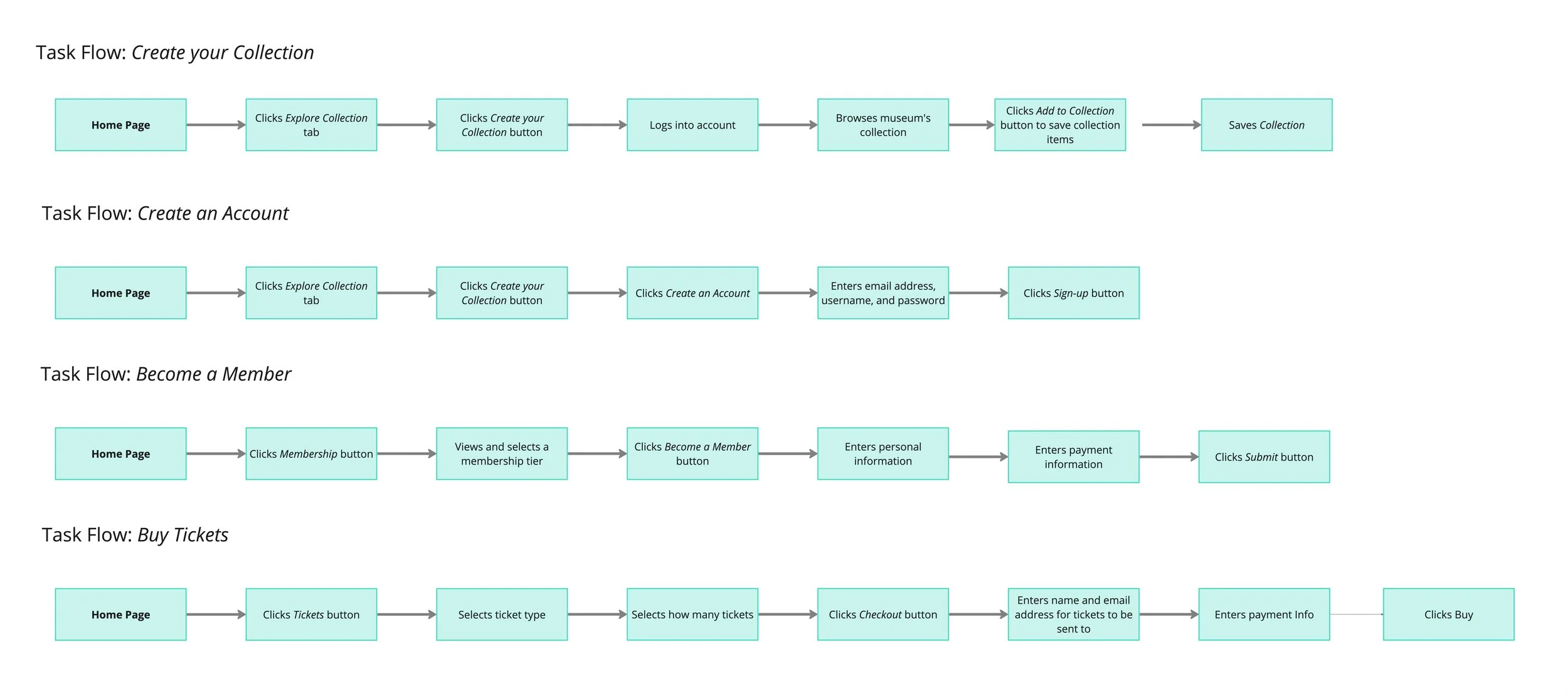
Additionally, our team created four task flows for key objectives that site visitors may need to complete when visiting the site. We designed these task flows in order to provide the project stakeholders with a clear understanding of how these key tasks could be re-imagined in order to facilitate higher task completion rates.
2 | Task Flows
Wireframes and Prototypes
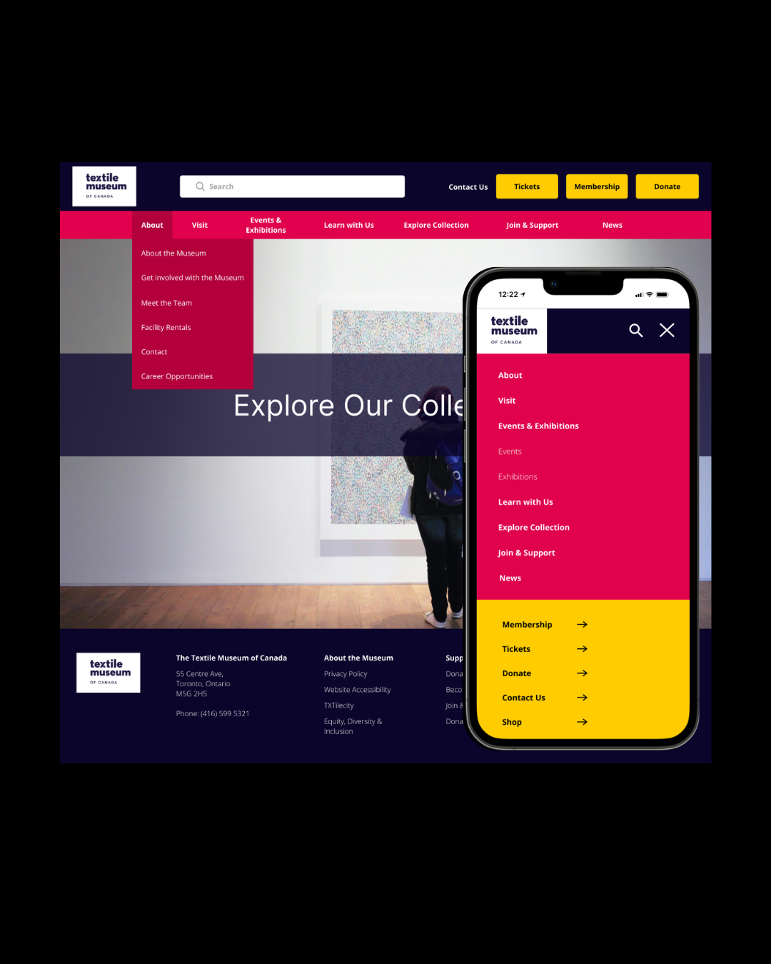
After a preliminary round of ideation on potential design ideas for the site navigation system, my team came together to develop the final version of the desktop and mobile navigation design prototypes, which are shown below.
The desktop version of the site utilizes a series of drop-down menus for the navigation system. This method of openly displaying the highest level of content labels helps facilitate user browsing across the site, and additionally makes it easy to navigate across the content hierarchy.
In our proposed design for the mobile version, we chose to use a classic hamburger menu opening to a series of dropdown menus. This choice allows for site visitors to quickly navigate the content hierarchy at a glance
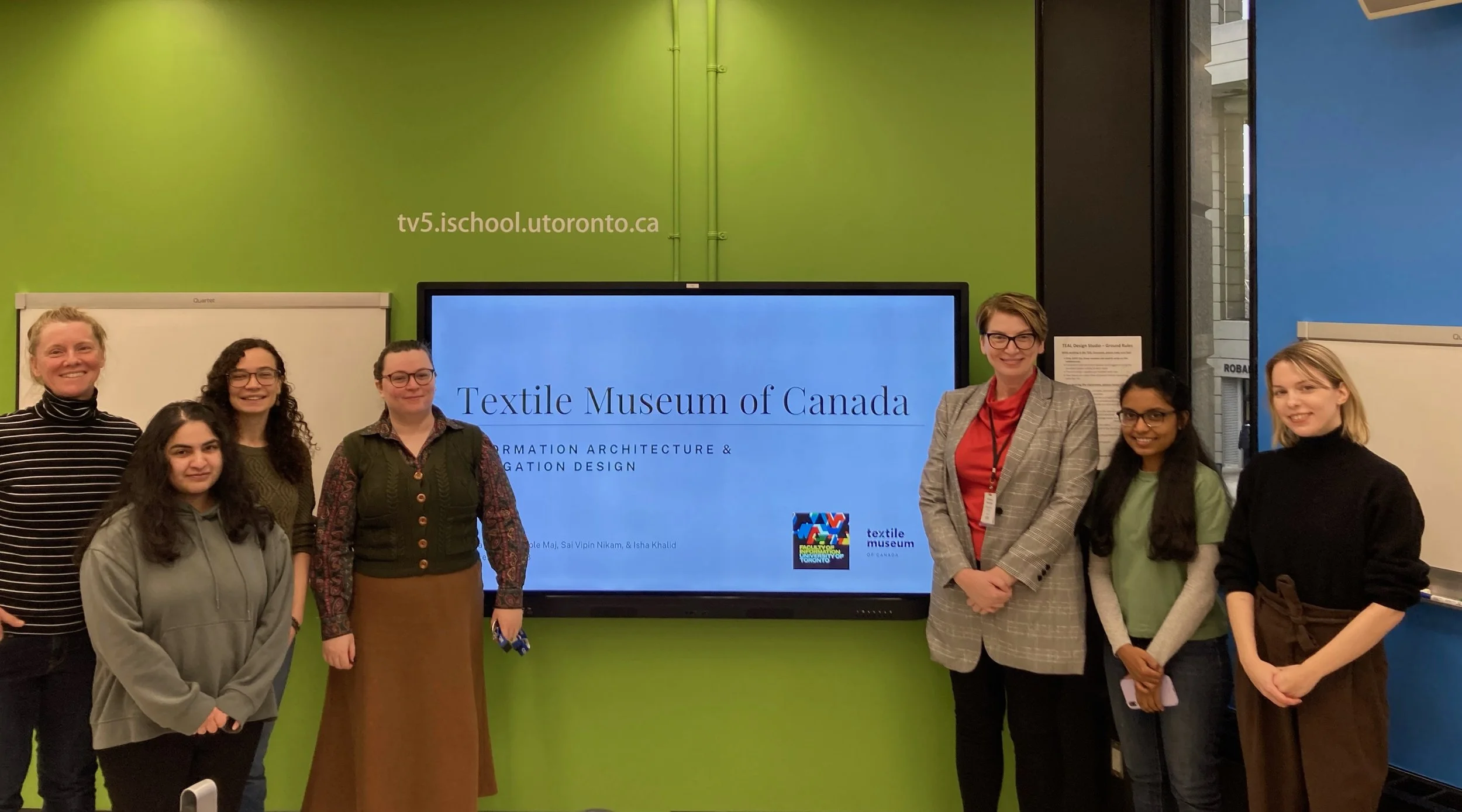
Client Handoff
After finalizing our designs, our team was able to present our design work to executives of the Textile Museum of Canada, where we discussed the motivations and research-based decisions for our design choices. Our work was warmly received, and the client representatives conveyed how they believed our designs would improve the overall user experience of the site.